Xander Hoogewerf is the Co-Founder and Chief Technical Officer (CTO) at Content Stadium — and a UX (user experience) super fan! He and his team ensure that a great UX is at the forefront of everything they create for our clients.
Discover his journey with development and UX, from programming as an 8 year old, to the user-centric logic behind our Content Stadium platform and our latest content creation solution: Content Stadium LIVE.
Where did your interest for all things development and UX start?
“As an 8-year-old kid back in 1989, I started programming Batch Scripts on my father’s Atari 8088 computer. I set up commands that would auto-execute when booting the computer, to save time when starting my games. But in those days, computers weren’t cheap. So you can imagine that my parents weren’t so happy about me messing with theirs! For me, it opened my eyes to how a little programming can simplify an experience.
“At 14, I started programming more serious software in Visual Basic. This is where I learned the basics of using UI (user interface) elements. Then a couple of years later, I sold my first parental control software, which ran in over 50 schools in the Netherlands.”


I can play with an app for hours just to analyze the interface and UX choices that have been made.
Xander Hoogewerf | Co-Founder and CTO at Content Stadium
How did you learn everything you know now?
“I developed a strong interest in the visual part of programming. So, I ended up studying Game Design & Development at the University of the Arts (HKU) in Utrecht, the Netherlands. There, I learned the basics of interaction design.
“But even before going to college, I had already made a number of small games. And for everything else I am mostly self-taught. If something interests me, I will go for it and won’t stop until I get the hang of it completely. For example, I can play with an app for hours just to analyze the interface and UX choices that have been made.
“After my education, I started working as a game developer. As good UX is so important to games, this experience helped me learn a lot about good (and bad) UX design.”
So what do you think makes a great UX designer?
“Although you can certainly develop into a good UX designer, in my opinion it is also something that you, as a person, should have a feel for. Do you take something as it is, or do you try to understand why it works the way it works?
“Understanding user behavior is of course also key to UX. Personally, I enjoy reading books by Robert Cialdini. Cialdini is an expert in psychology and has great insight into how people make choices, and how you can influence and guide these choices.”
KISS is one of the principles that has always been drilled into us at school: keep it simple, stupid. A good UX should feel logical and simple.
Where did the idea for the Content Stadium platform come from?
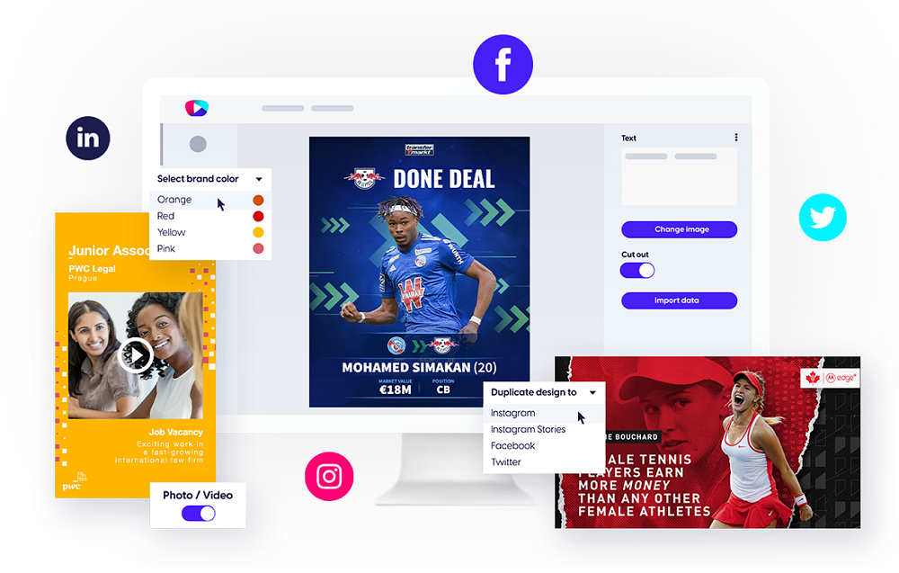
“The idea for the platform came about when talking to my colleagues who were managing the social media accounts of a football brand. They told me about the challenges they faced when creating social media visuals, including a lack of designers on the weekends, their lack of experience with Photoshop, and the need for creating content at speed during matches.
“So I got to work and started with a simple prototype that could solve their immediate challenges: a template-based content creation platform that could be used by anyone. After a successful trial with our editorial team, we continued to develop the platform into what is now Content Stadium CREATE.”

What UX rules have you and your team applied to the Content Stadium platform?
“The priority was that the platform had to remain fast and simple, whatever we decided to add in the future. KISS is one of the principles that has always been drilled into us at school: keep it simple, stupid. A good UX should feel logical and simple.
“When building the platform, the user was always at the forefront of our decisions. We kept in mind that not every user is a designer. So ease of use should stay number one, no matter what.
“In addition, for most of our clients it was crucial that their brand identity remains visible and consistent. So we make sure that this cannot be tampered with — unless the client wants to!
“We’ve since continued to improve and expand the features that we offer our clients. These now include data import, color and theme switches, functional switches and so much more. But we always keep these primary rules in mind, while building client templates or adding new functionalities to the platform.”
Our Content Stadium LIVE app is based on the same principle as our CREATE template-based solution: the app must be fast and simple to use. Each user must be able to use it without a real learning curve.
You’ve recently built a new app: Content Stadium LIVE. What is the UX logic behind this app?
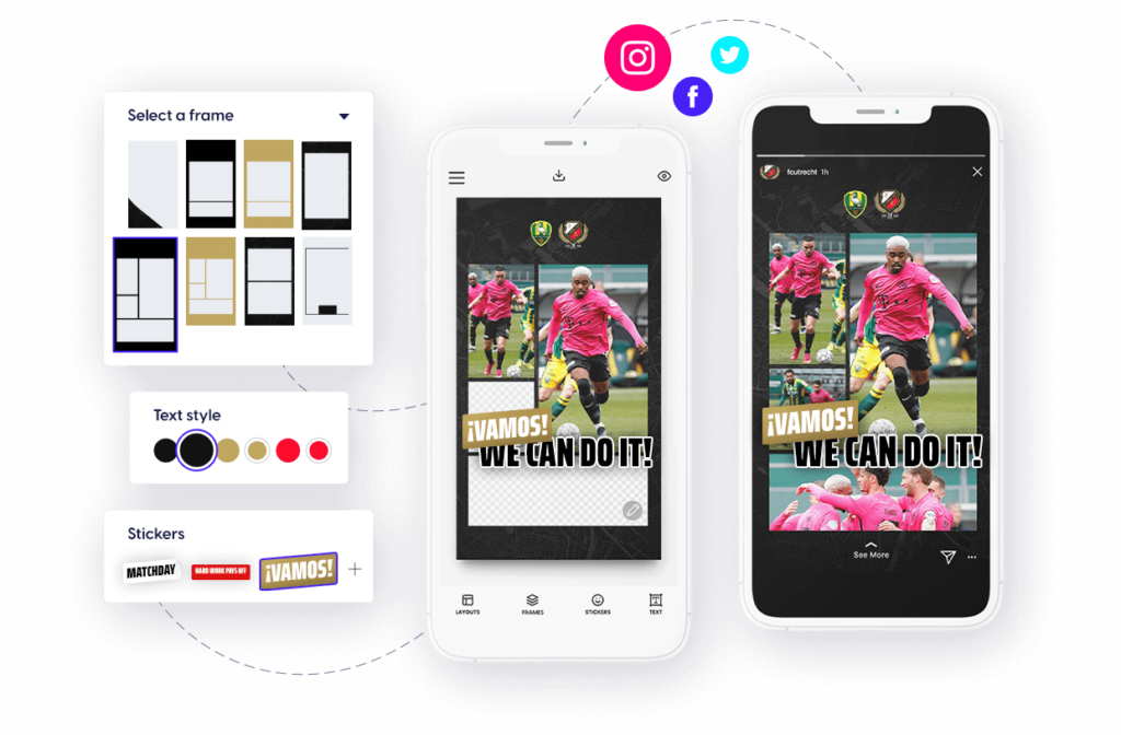
“Our new LIVE mobile app is based on the same principle as our CREATE template-based platform: the app must be fast and simple to use. Each user must be able to use it without a real learning curve.
“But this app had to be even faster, since its main purpose is to create in-the-moment content, to cover live events. So, we made sure to automate any complicated actions.

“For example, apps that are similar to ours often work with cutting lines. This means that users must manually move and scale their images and videos to fit predefined content areas in their frames. But this is less than ideal when you’re trying to quickly create content on the go.
“So instead, we’ve automated this process. LIVE users can choose to automatically adjust their images and videos to fit their frames. With this valuable feature, we reduce the time it takes to create branded content to only a fraction of the time that might be necessary with other tools.”
Curious to know more?
Explore our original tool, Content Stadium CREATE. And learn more about our new app Content Stadium LIVE.
Plus, meet our clients and read their reviews of Content Stadium.


